

The Floor Plan You Inherited Isn’t the Floor Plan You Have to Keep
One of my favorite parts of a renovation happens before we choose a single finish.
It’s the moment we look at something a client has been living with for years and ask, But does it actually have to stay that way?
For this renovation, that question centered around the ceiling.
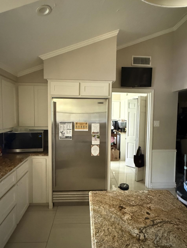
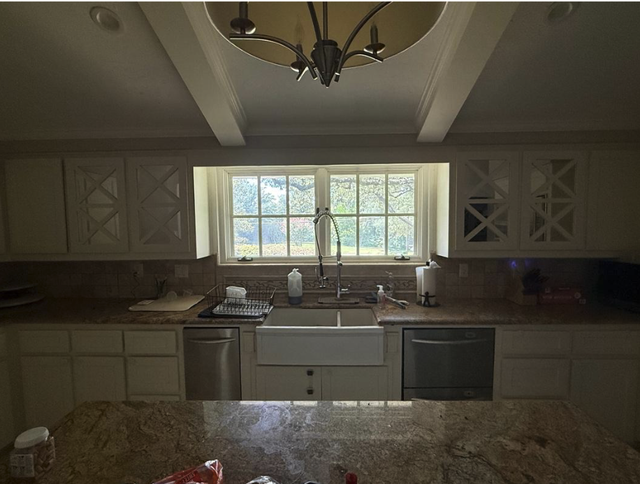
The existing kitchen sits beneath a pitched roofline, and naturally, our client assumed the new kitchen would need to work around it too.
She had lived with the architecture long enough that the pitch had become one of those things you stop questioning.
The kitchen could get prettier, the cabinetry could change, the island could become larger, but that sloping ceiling? Apparently that was simply part of the deal.
Except… we didn’t agree.
The pitch itself wasn’t necessarily the problem.
The problem was allowing one of the most social, hardworking spaces in the home to sit directly underneath the lowest part of it.
And once we started looking at the floor plan differently, the entire renovation opened up.
What She Thought We Had to Work With
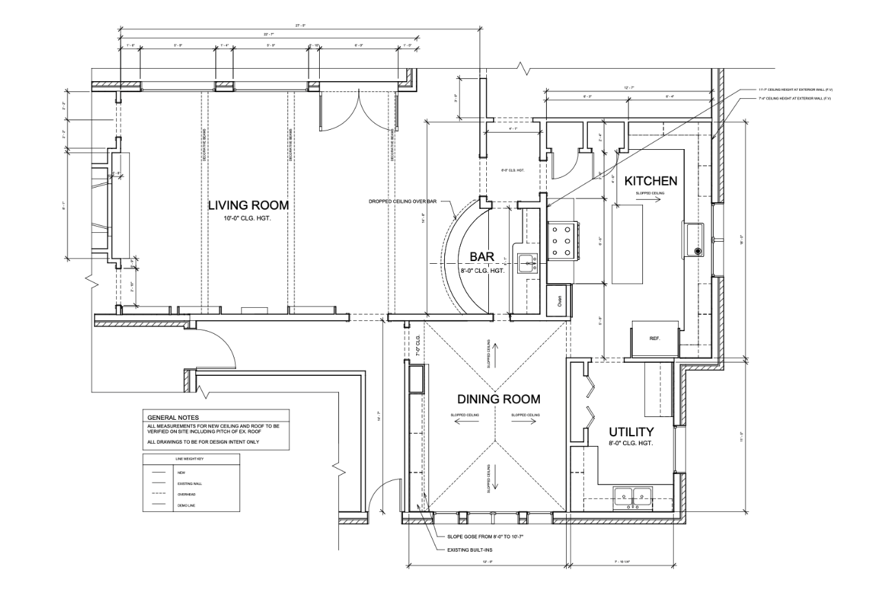
We actually explored the version our client initially expected first, because sometimes seeing an idea drawn out is the easiest way to understand why we’re recommending something different.
In that plan, the kitchen essentially stayed where it was.
We just enlarged the island so there would be more room for the kids to sit and do homework, updated the cabinetry and worked within the footprint that already existed.
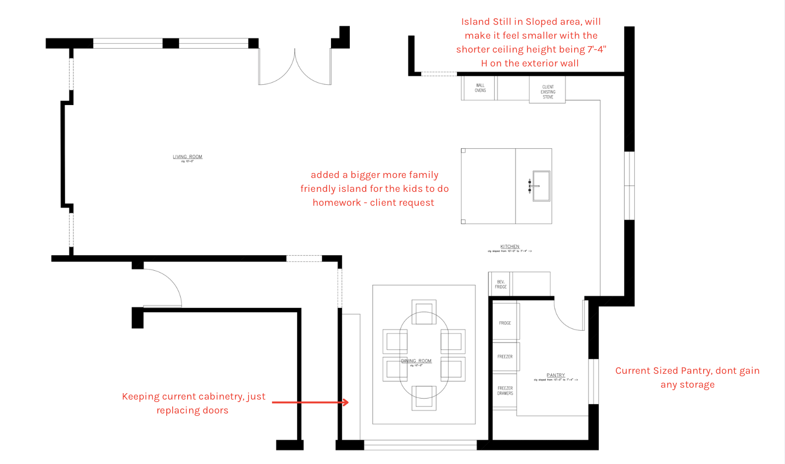
On paper, it checked several boxes.
The problem appeared when we looked up.
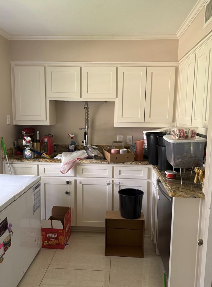
The island still sat within the pitched portion of the room, with the ceiling dropping to roughly 7’4″ along the exterior wall.
Rather than making the kitchen feel open and generous, the architecture would continue compressing the space right where the family spends so much of its time.
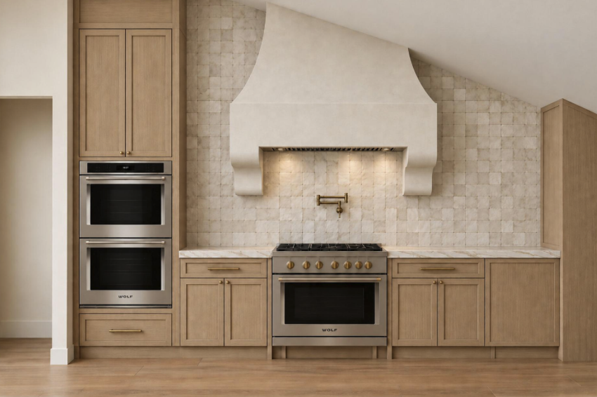
The pantry also remained close to its existing size, which meant we weren’t really gaining meaningful storage, and some of the existing cabinetry was simply receiving new doors.
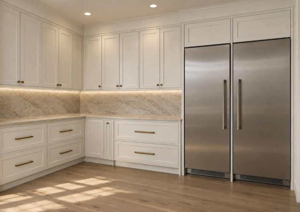
It would have been an improvement.
It just wasn’t enough of one.
When you’re renovating, there’s a temptation to assume that existing walls, ceiling conditions and room labels automatically dictate the next version of the house. Sometimes they do, but other times we’re simply spending a lot of money making the same layout prettier.
That is usually the point where I start asking more questions.
So We Moved the Kitchen
Not across the house or into an addition.
We thought: which part of the existing footprint deserved to become the heart of it.
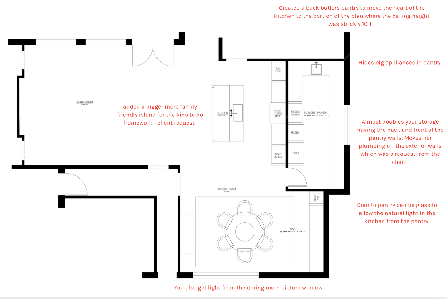
The alternative plan moves the main kitchen into the portion of the room where the ceiling remains a consistent 10 feet high.
With that change the range wall has breathing room. The cabinetry can read symmetrically, the hood becomes a focal point rather than something we have to squeeze beneath a changing roofline, and the island sits within a space that feels appropriately scaled for the way this family actually wants to use it.
That distinction matters.
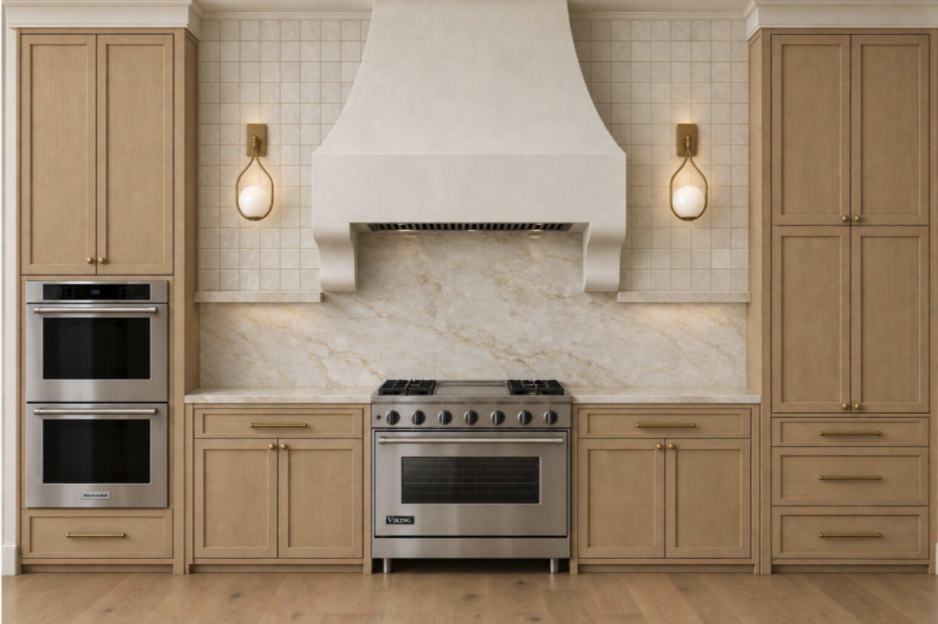
A floor plan isn’t successful because everything “fits”. It needs to feel good when you’re standing in it.
Ceiling height affects that far more than people realize.
You can have the exact same cabinetry, stone and beautiful lighting, but if the architecture is closing in around the main gathering space, you’re always going to feel it.
So rather than trying to disguise the pitch with cabinetry, we stopped asking the kitchen to live underneath it.
The Pitch Didn’t Disappear, We Just Gave It a Better Job.
This is probably my favorite part of the plan because we didn’t need to pretend the architecture wasn’t there.
We used it differently.
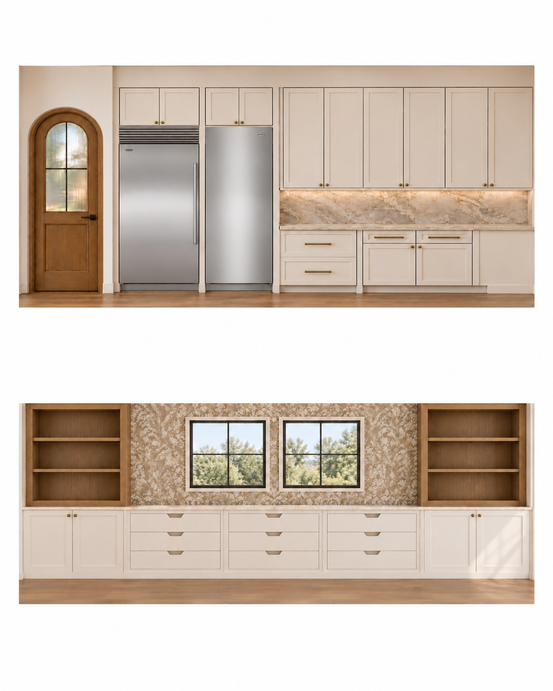
The area toward the exterior wall becomes a back butler’s pantry, allowing the lower ceiling condition to sit within a secondary working space instead of visually dominating the kitchen.
And that one move solves far more than the ceiling.
By creating cabinetry along both sides of the pantry, we’re nearly doubling the storage available to the client. The larger appliances can live back there too, which means the main kitchen doesn’t need to visually carry every refrigerator, freezer and tower cabinet the family needs.
There is also something I will almost always appreciate about being able to hide the hardworking bits of a kitchen.
You can absolutely have a beautiful refrigerator. I just don’t necessarily need it to be the first thing I see.
The revised plan also moves plumbing away from the exterior walls, which was important to the client, while a glass pantry door gives us the opportunity to bring natural light from the pantry back into the kitchen.
The awkward part of the existing architecture isn’t something we’re designing around. It’s helping create one of the most functional spaces in the house.
And Then We Looked at How the Family Actually Lives
Changing the kitchen gave us the opportunity to rethink the surrounding spaces rather than treating each room as its own little island.
Our client specifically wanted a larger kitchen island where the kids could do homework, so that became part of the planning from the beginning rather than something we tried to squeeze in once the cabinetry was decided.
That’s an important difference in how we work.
A request like “I want the kids to do homework at the island” sounds simple, but it tells us quite a lot. We need enough usable seating, comfortable circulation behind it and a kitchen layout that still functions when backpacks, laptops and approximately seventeen water bottles inevitably join whatever Mom is making for dinner.
The new location gives us the room to do that without asking the family to work around the architecture.
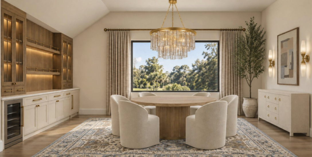
From there, the dining room becomes part of the wider plan too. Its large picture window brings another source of natural light toward the kitchen, while a dedicated bar adds storage and gives entertaining its own beautifully considered moment.
Nothing feels like an afterthought because we’re solving the rooms together.
This Is Why We Start With the Floor Plan
It’s very easy to walk into an existing home and immediately start thinking about what needs replacing.
New cabinet doors.
Better countertops.
New flooring.
A prettier light fixture.
All of those things can absolutely transform a space, but they can’t fix a floor plan that was asking too much of them in the first place.
Had we accepted the original kitchen location without questioning it, we could have created a very beautiful kitchen beneath that pitched ceiling.
The finishes would still have been lovely, the island could still have been larger and the photographs probably would have looked great from the right angle.
But our client would still have been living with the exact architectural compromise she assumed she had no choice but to accept.
That’s where a renovation can become much more interesting.
The ceiling pitch is still part of this home. We’ve just moved it away from the space where everyone will gather, cook, do homework and spend the majority of their time, then turned that area into storage and function the family genuinely needs.
Same house.
Very different experience.
And that’s exactly why we draw the floor plan before we start choosing the pretty things.

Leave a Reply
signature services


custom
new builds

virtual playbook


